How to Calibrate a Color Printer for Accurate Graphic Design?
Have you ever spent hours perfecting a design on your screen, only to hit “Print” and get a result that looks nothing like what you expected? The reds look orange. The blues appear dull. The skin tones seem unnatural.
This frustrating mismatch between your monitor and your printer is one of the most common problems graphic designers face every day. The good news is that this problem has a clear solution: printer color calibration.
Color calibration is the process of adjusting your printer and monitor so they produce consistent, accurate colors. Without proper calibration, your entire design workflow operates on guesswork.
This guide walks you through the full process of calibrating a color printer for graphic design work. You will learn about the tools you need, the steps to follow, and the mistakes to avoid.
Key Takeaways
- Calibrate both your monitor and printer to close the gap between what you see on screen and what appears on paper. One without the other will still produce color mismatches.
- Use ICC profiles for your printer, paper, and monitor. These profiles act as a shared color language between all your devices and ensure each one interprets color data the same way.
- Invest in a hardware calibration tool such as a colorimeter or spectrophotometer if you do professional design work. Software calibration tools built into Windows and macOS can help, but hardware tools deliver far greater accuracy.
- Recalibrate your devices regularly, ideally every two to four weeks. Monitor backlights shift over time, ink levels change, and environmental factors like ambient light can alter how colors appear.
- Choose the correct color space for your project. Use CMYK profiles for print work and RGB for digital output. Keeping a master file in Adobe RGB (1998) and converting copies for specific outputs is a widely recommended practice.
- Paper type directly affects color output. Glossy, matte, and uncoated papers all absorb and reflect ink differently. Always match your printer driver settings and ICC profile to the exact paper you plan to use.
Why Color Calibration Matters for Graphic Designers
Color calibration is not optional for anyone who produces printed graphic design work. Your monitor uses the RGB (Red, Green, Blue) color model to display colors by emitting light. Your printer uses the CMYK (Cyan, Magenta, Yellow, Black) color model to reproduce colors by layering ink on paper. These two systems work in fundamentally different ways.
RGB produces colors by adding light together. CMYK produces colors by subtracting light through ink absorption. Because of this core difference, a bright, vivid green you see on your screen may print as a duller, shifted version on paper. This is not a defect in your printer. It is a natural consequence of two different color systems trying to match each other.
Professional print shops and agencies treat color calibration as a standard part of their workflow. They know that consistent color builds client trust and reduces costly reprints. A single reprint job because of wrong colors can waste hours of labor, expensive ink, and premium paper stock.
Color calibration also protects your creative intent. You chose specific colors for a reason. Those choices carry meaning in your design. If your print output shifts those colors, the design loses impact. Calibration preserves your creative decisions from screen to paper.
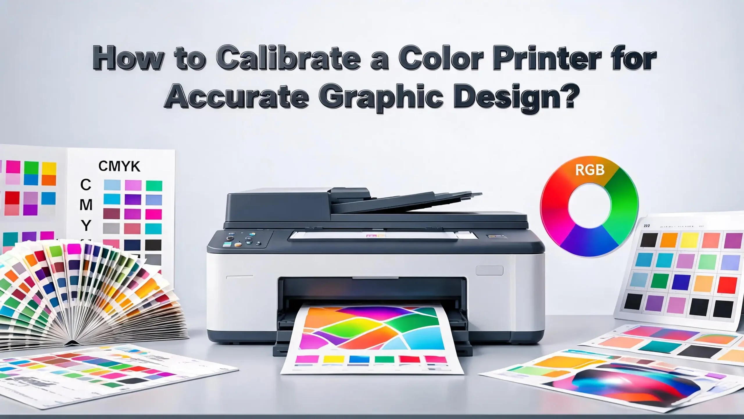
Understanding Color Spaces: RGB vs. CMYK
A color space defines the range of colors a device can produce. This range is called the color gamut. RGB has a larger gamut than CMYK. This means RGB can display many colors that CMYK simply cannot reproduce with ink on paper.
When you design in RGB on your screen, you might select a vibrant electric blue or a neon green. These colors exist within the RGB gamut but fall outside the CMYK gamut. When your printer tries to reproduce them, it substitutes the closest available CMYK color, and the result often looks flat or shifted.
Adobe RGB (1998) is a wider RGB space commonly used by designers and photographers. sRGB is a smaller RGB space used for web content and consumer displays. For print work, most experts recommend keeping your master files in Adobe RGB (1998) or ProPhoto RGB. You then convert copies of those files to the CMYK profile recommended by your print vendor.
Each CMYK profile represents a specific combination of press type, ink set, and paper stock. Using the wrong CMYK profile can produce results just as inaccurate as having no calibration at all. Always ask your print vendor which CMYK profile they recommend before you convert your files.
Understanding these color spaces helps you set realistic expectations. Your print will never look exactly like a backlit screen. But with proper calibration and correct color space settings, you can get very close.
How ICC Profiles Work and Why You Need Them
ICC profiles are standardized files created by the International Color Consortium. They describe how a specific device reproduces color. Every monitor, printer, scanner, and camera can have its own ICC profile. These profiles act as a translation layer between devices.
When your design software reads an ICC profile for your printer, it knows exactly how that printer will interpret color data. The software can then adjust the color information it sends to the printer so the output matches your intent. Without ICC profiles, your software sends raw color numbers to the printer, and the printer interprets those numbers using its own default settings.
Most modern printers come with manufacturer installed ICC profiles. These profiles load automatically when you select the printer in applications like Adobe Photoshop, Illustrator, or InDesign. However, these generic profiles may not account for the specific paper you use or the current condition of your ink cartridges.
You can create custom ICC profiles using a spectrophotometer. This process involves printing a color chart with hundreds of color patches, then scanning those patches with the device. The software compares the printed colors to the expected colors and generates a profile that compensates for any differences.
To install an ICC profile on Windows, right click the .icc file and select Install Profile. On macOS, copy the file to the ColorSync Profiles folder. Once installed, you can select that profile in your design software’s print dialog or color management settings.
Setting Up Your Workspace for Accurate Color
Your physical workspace directly affects how you perceive color on your monitor. A room flooded with warm yellow light from a desk lamp will make your screen colors appear different than they would under neutral lighting. Ambient light is one of the most overlooked factors in color accuracy.
Color experts recommend working in a room with controlled, consistent lighting. Avoid direct sunlight hitting your screen. Overhead fluorescent lights with a daylight color temperature around 5000K to 6500K work well for design work. Keep the lighting at the same level throughout your work sessions.
Your monitor should be clean and free of dust. Even a thin film on the screen surface can shift how colors appear. Wipe your display with a microfiber cloth regularly. It sounds simple, but many calibration problems trace back to a dirty screen.
Let your monitor warm up for 20 to 30 minutes before you begin any color critical work. Display backlights shift in color temperature as they warm up from a cold start. Working immediately after powering on your monitor means you are viewing colors through a shifting baseline.
Set your monitor to its native resolution, which is usually the highest available setting. Lower resolutions can alter how fine color gradients and details appear. Also, disable any power saving modes that dim the screen after a few minutes of inactivity. These modes change brightness and color temperature in ways that undermine calibration.
How to Calibrate Your Monitor for Print Work
Monitor calibration is the first step in a color managed workflow. If your monitor displays inaccurate colors, every design decision you make will be based on false information. Think of it this way: your monitor is your window into your artwork. A dirty or distorted window gives you a distorted view.
Windows includes a built in calibration tool. Search for “Calibrate Display Color” in the Start menu and follow the on screen instructions. The tool walks you through adjusting gamma, brightness, contrast, and color balance. This method is free and suitable for basic needs, but it relies on your eyes rather than precise instruments.
macOS also offers a built in option. Go to System Preferences, select Displays, then click the Color tab. Select Calibrate to launch the Display Calibrator Assistant. This tool creates an ICC profile for your display based on your adjustments.
For professional results, use a hardware colorimeter. Devices from brands like Datacolor and X Rite attach to your screen and measure the actual colors your monitor produces. The companion software then creates a precise ICC profile. This process removes human error from the equation entirely.
Color experts at Pantone recommend recalibrating your monitor every two to four weeks. Monitor backlights age and shift gradually, and even small changes can affect color accuracy over time. Some calibration software includes built in timers that remind you to recalibrate on schedule.
Step by Step Printer Calibration Process
Once your monitor is calibrated, you can move on to calibrating your printer. This process ensures the printer’s output matches the calibrated colors on your screen. Follow these steps for a thorough calibration.
Step 1: Clean your printer heads. Clogged or dirty print heads produce uneven ink distribution, which causes color shifts and banding. Run the built in head cleaning utility from your printer’s software or control panel. Print a nozzle check pattern to confirm all nozzles fire correctly.
Step 2: Load the paper you plan to use for your final prints. Different papers absorb ink differently. Calibrating with one paper type and printing on another will produce mismatched colors. Always calibrate using the same paper stock you will use for production prints.
Step 3: Select the correct paper type in your printer driver. The paper type setting controls how much ink the printer lays down. Selecting “plain paper” when using glossy photo paper, or the reverse, will produce poor results.
Step 4: Print a color test chart. Many calibration tools include standardized test charts with hundreds of color patches. If you are using manual calibration, you can download free test images online.
Step 5: Measure the printed colors using a spectrophotometer or colorimeter. The device reads each patch and compares the printed color to the expected value. The calibration software then generates a custom ICC profile for your specific printer, ink, and paper combination.
Step 6: Install and activate the new profile in your operating system and design software. From this point on, select this profile in your print dialog for accurate output.
Using Soft Proofing to Preview Print Results
Soft proofing is a feature in design software that simulates how your design will look when printed. It applies the printer’s ICC profile to your on screen view, giving you a preview of the final output before you use any ink or paper.
In Adobe Photoshop, go to View, then Proof Setup, then Custom. Select the ICC profile for your printer and paper combination. Enable “Simulate Paper Color” to see how the white of your paper stock will affect the overall appearance. The preview may look slightly duller or warmer than your original design, and that is normal.
Adobe Lightroom also offers soft proofing in the Develop module. Click the Soft Proofing checkbox below the main image. Choose your target printer profile from the dropdown menu. Lightroom shows you which colors fall outside the printer’s gamut by highlighting them.
Soft proofing lets you make adjustments before printing. If you notice a particular shade of blue shifts too far toward purple in the soft proof, you can adjust that color in your working file. This saves you from wasting prints on trial and error corrections.
Keep in mind that soft proofing is only as accurate as your monitor calibration and your ICC profiles. If either one is outdated or incorrect, the soft proof will mislead you. Make sure all profiles are current and your monitor is freshly calibrated before relying on soft proof previews.
Choosing the Right Paper for Color Accuracy
Paper plays a larger role in color accuracy than most designers realize. The surface texture, coating, weight, and whiteness of your paper all influence how ink sits on the surface and how light reflects off the final print. Choosing the wrong paper can undo all your calibration work.
Glossy papers produce vibrant, saturated colors with sharp detail. The smooth, coated surface prevents ink from spreading, which keeps fine details crisp. Glossy paper works well for photographs and designs with rich color.
Matte papers absorb more ink and scatter light across their textured surface. This creates a softer look with less contrast. Colors on matte paper appear more subdued than on glossy. Matte paper is often preferred for fine art prints, text heavy designs, and pieces that will be displayed under glass.
Uncoated papers absorb the most ink, which can cause colors to look washed out. Standard office copy paper falls into this category. It is not suitable for color critical graphic design prints.
Always match your printer driver paper setting to the actual paper in your printer tray. When you select a paper type in the driver, the printer adjusts its ink volume, drying time, and head movement. A mismatch between the setting and the actual paper causes oversaturation, bleeding, or dull colors.
Many paper manufacturers provide downloadable ICC profiles for their papers. These profiles describe how their paper interacts with specific printer and ink combinations. Using the manufacturer’s paper profile gives you better color accuracy than relying on a generic printer profile alone.
Manual Calibration vs. Hardware Calibration
There are two main approaches to printer calibration: manual (visual) calibration and hardware based calibration. Each approach suits different needs and budgets.
Manual calibration involves printing test images and comparing them to a reference image on your calibrated monitor or a printed color guide. You then adjust the printer’s color settings through its driver or software until the output matches your reference. This method costs nothing beyond ink and paper but relies heavily on your eyes, which are not objective measuring instruments.
Human color perception changes with fatigue, ambient light, and even what color clothing you wear near the screen. Two people looking at the same print may disagree on whether the colors match the reference. Manual calibration can get you in the right ballpark, but it lacks the precision professionals need.
Hardware calibration uses a colorimeter or spectrophotometer to measure printed colors objectively. A spectrophotometer is more advanced than a colorimeter because it measures the full spectrum of light reflected from each color patch. This produces extremely accurate profiles.
Hardware calibration tools range in price from about $100 for basic colorimeters to $500 or more for professional spectrophotometers. If your work depends on color accuracy, this investment pays for itself quickly by reducing wasted materials and reprints.
For professional graphic designers, hardware calibration is the recommended standard. For hobbyists or designers doing occasional print work, manual calibration combined with the built in OS tools may be sufficient.
Configuring Color Settings in Adobe Software
Adobe Creative Cloud applications offer detailed color management controls. Configuring these settings correctly is essential for accurate print output. Incorrect color settings in Photoshop, Illustrator, or InDesign can override your calibration work.
In Photoshop, go to Edit, then Color Settings. Under Working Spaces, set RGB to Adobe RGB (1998) for print work. Set CMYK to the profile your print vendor recommends. If you do not know which profile to use, U.S. Web Coated (SWOP) v2 is a common default for standard commercial printing in North America.
Under Color Management Policies, set all three options (RGB, CMYK, Gray) to Preserve Embedded Profiles. Check the boxes for “Ask When Opening” and “Ask When Pasting” to ensure you are always aware of profile mismatches. This prevents the software from silently converting colors and introducing errors.
When you print from Photoshop, you have two choices for color handling. You can let Photoshop manage colors or let the printer manage colors. Do not enable both at the same time, as this applies color correction twice and produces inaccurate results. For the best accuracy, let Photoshop manage colors using your installed ICC printer profile, and disable color management in the printer driver.
In InDesign, the color settings should match your Photoshop settings. You can synchronize color settings across all Adobe applications using Adobe Bridge. Open Bridge, go to Edit, then Creative Suite Color Settings, and apply the same configuration to all installed Adobe apps.
Troubleshooting Common Color Calibration Problems
Even with careful calibration, problems can still appear. Here are the most common issues and their solutions.
Prints are too dark. This is the single most reported calibration complaint. It often happens because your monitor brightness is set too high. Your screen shows bright, luminous colors, but paper cannot emit light. Lower your monitor brightness to around 80 to 120 cd/m2 for print work. Also, use the “Simulate Paper Color” option in soft proofing to get a more realistic preview.
Colors shift between prints. If successive prints show different colors, check your ink levels. Low ink in any single cartridge will shift the color balance. Also verify that your print head nozzles are clean and firing correctly. Run a nozzle check pattern after every head cleaning.
Prints do not match the soft proof. Make sure you selected the correct ICC profile in both the soft proof setup and the print dialog. Double check that color management is handled by either the software or the printer driver, but not both simultaneously.
Warm or cool color cast across the entire print. This usually indicates an incorrect paper profile or a mismatch between the paper type setting in the driver and the actual paper loaded. Verify that both match. If the problem persists, recalibrate with a fresh ICC profile for that paper.
Banding or streaks in gradient areas. This is a hardware issue, not a calibration issue. Clean the print heads and run an alignment utility. Replace any cartridges that are nearly empty. Banding often appears when one ink color runs lower than the others.
How Often Should You Recalibrate Your Printer
Calibration is not a one time task. Your printer, monitor, and workspace conditions change over time, and your profiles must keep up with those changes. A profile created six months ago may no longer reflect how your devices perform today.
Most color management experts recommend recalibrating your monitor every two to four weeks. In demanding professional settings, some designers calibrate weekly or even daily. Monitor backlights gradually shift in color temperature and brightness as they age, and these shifts accumulate over time.
For printers, the recalibration schedule depends on your print volume and the stability of your equipment. If you print every day, recalibrate your printer at least once a month. If you print less frequently, recalibrate whenever you switch paper types, install new ink cartridges, or notice a visible shift in color quality.
Environmental changes also trigger the need for recalibration. Moving your workspace to a different room, changing your desk lamp, or shifting from summer to winter daylight can all affect how you perceive colors on your monitor. Recalibrate after any significant change to your work environment.
Keep a calibration log that records the date of each calibration, the tool you used, and any notes about changes you observed. This log helps you identify patterns and predict when your next calibration will be needed. Over time, you will develop a rhythm that fits your specific workflow and equipment.
Building a Complete Color Managed Workflow
Individual calibration steps work best as part of a complete color managed workflow. This means every device in your chain, from your camera or scanner to your monitor to your printer, operates under a consistent set of ICC profiles and color settings.
Start by calibrating your monitor with a hardware tool. This establishes the visual reference you will use for all design decisions. Next, configure your design software with the correct working spaces and color management policies. Then calibrate your printer for each paper and ink combination you use regularly.
Color management is not color correction. If your original photo or artwork has poor color, a calibrated workflow will faithfully reproduce that poor color. Fix color issues in your editing software before printing. Calibration ensures accurate reproduction, not automatic improvement.
Embed ICC profiles in every file you save. An embedded profile tells any application that opens the file what color space the file was created in. Without an embedded profile, the receiving application applies its own default, which may shift your colors. Always choose “Embed Color Profile” when saving from Photoshop, Illustrator, or any other design application.
When sending files to a commercial print vendor, ask them for their preferred ICC profile and convert your files accordingly. Provide a printed proof or a PDF with embedded profiles so the vendor has a clear reference for your expected output. Good communication with your print partner is just as important as technical calibration.
Tips for Maintaining Long Term Color Consistency
Consistency over time requires discipline and routine. Here are practical habits that will keep your color output reliable month after month.
Use the same brand and type of ink for all your prints. Third party inks may save money, but they can produce different color characteristics than the inks your ICC profile was built for. If you switch inks, you need a new profile.
Store your paper properly. Paper absorbs moisture from the air, which changes how it handles ink. Keep paper in its original sealed packaging until you need it. Store it in a cool, dry location away from direct sunlight. Humidity can cause color shifts, paper curling, and ink bleeding.
Keep your printer firmware and drivers updated. Manufacturers occasionally release updates that improve color processing or fix known issues. Check for updates every few months.
Document your workflow settings. Write down your monitor profile, your color space settings, your printer driver configuration, and your paper profiles. If something goes wrong, you can trace back to the exact setting that changed. This documentation also helps if you move to a new computer or upgrade your printer.
Run a weekly test print using a standardized reference image that includes skin tones, saturated colors, neutral grays, and fine gradients. Compare each week’s print to a known good reference print. If you see a shift, recalibrate before it grows into a bigger problem. Catching drift early saves you from printing an entire batch of inaccurate work.
Frequently Asked Questions
What is printer color calibration and why do graphic designers need it?
Printer color calibration is the process of adjusting your printer’s color output so it accurately reproduces the colors in your digital design files. Graphic designers need this because monitors and printers use different color systems, RGB and CMYK respectively. Without calibration, the colors you see on screen will not match the printed result. Calibration creates a bridge between these two systems using ICC profiles and precise device measurements.
Can I calibrate my printer without buying expensive tools?
Yes, you can perform basic calibration using the built in tools in Windows or macOS and by manually comparing test prints to your screen. However, this visual method relies on your eyes, which are not as precise as a hardware colorimeter or spectrophotometer. For casual or occasional print work, manual calibration may be enough. For professional projects where color accuracy is critical, a hardware tool will produce significantly better results.
How often should I recalibrate my monitor and printer?
Color experts recommend recalibrating your monitor every two to four weeks. Printers should be recalibrated at least once a month if you print regularly, and whenever you change ink cartridges, switch paper types, or notice a visible color shift. Environmental changes like new room lighting also call for recalibration.
Why do my prints always look darker than my screen?
This is the most common calibration complaint. Your monitor emits light, which makes colors appear bright and vivid. Paper absorbs and reflects light, which naturally produces a darker appearance. Lower your monitor brightness to 80 to 120 cd/m2 for print design work. Use the Simulate Paper Color option in your software’s soft proofing feature to preview how the print will actually look.
Should I design in RGB or CMYK for print projects?
The recommended practice is to design and keep your master files in Adobe RGB (1998) or ProPhoto RGB. These wider color spaces preserve the maximum amount of color data. When you are ready to print, convert a copy of your file to the CMYK profile specified by your print vendor. This gives you the best of both worlds: a rich master file and an optimized print file.
What role does paper play in color accuracy?
Paper has a major impact on printed color. Glossy paper produces vivid, saturated colors with sharp detail. Matte paper creates softer tones with less contrast. Uncoated paper absorbs more ink and tends to produce washed out colors. Each paper type requires its own ICC profile and matching printer driver settings. Using the wrong paper or the wrong settings will produce inaccurate color, regardless of how well your printer is calibrated.
I’m the voice behind Device Dossier. As a printing technology enthusiast, I spend my time testing printers, comparing specs, and writing honest reviews to help you find the perfect printing solution. When I’m not geeking out over print quality and page yields, you’ll find me exploring the latest in tech.